3 Important Design Principles for a Landing Page

My UX design team was given the assignment to redesign UVU’s Culinary Arts Department website. Several pages needed to be altered, including the landing page, which proved to be the most difficult part of the project. The problem: 3 different audiences. Our solution: addressing the audiences and their needs by relying on the design principles of hierarchy, picture superiority effect, and color.

Hierarchy. A quick way to call attention to the most important section of a document is to put it at the top. The next most important information is then listed second, and so on.
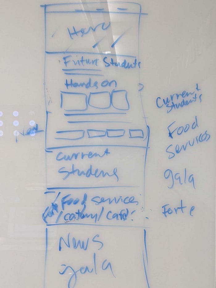
Upon meeting with our stakeholders, Troy Wilson and Mary Schumacher, my team and I learned that the most needed function of the website was to recruit future students, who were therefore the most important audience for the landing page. Of secondary importance were the current culinary students, followed by customers looking for the department restaurant and catering services. With this information, we sketched the general layout for the landing page.
Picture Superiority Effect. After viewing a webpage, people will remember the images better than they remember the text on the page. The images chosen need to be memorable.
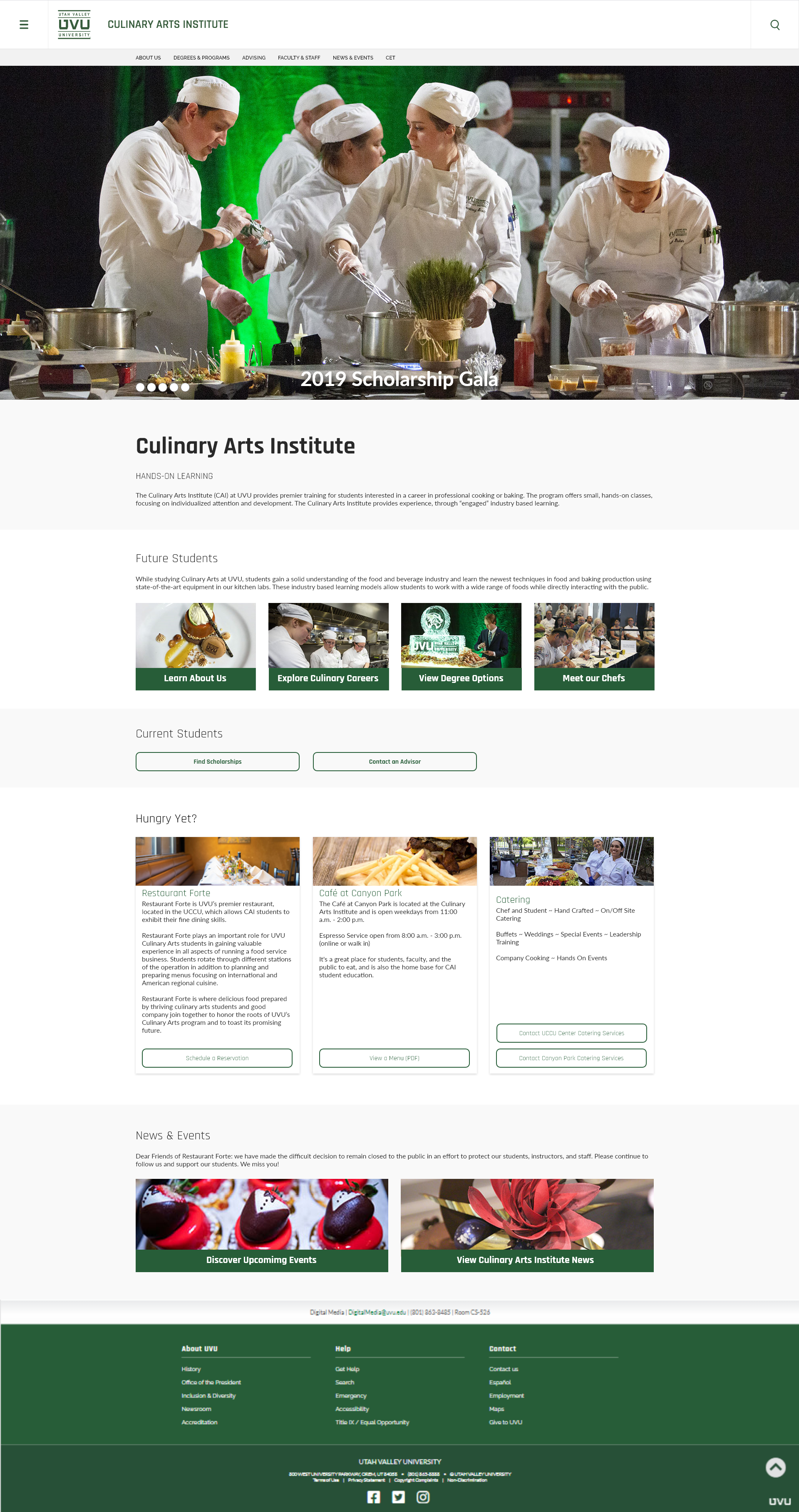
After our team worked together to decide on the general layout of the landing page, I was tasked with creating the surface comps. My initial impulse was to choose an image representing the university for the hero image. In subsequent iterations the initial image was replaced with one representing the students. The second image was better because it allowed the most important audience — prospective students — to imagine themselves in the picture. Ideally, when they later think of the Culinary Arts Institute at UVU, they will remember the image and the emotion generated by identifying with the students in the image. They will feel that they belong at UVU.


Color. The eye is drawn to color.
After the completion of the surface comps, we again met with our stakeholders to show them the prototype and receive feedback on our designs. Their one complaint about the landing page was that the desktop design needed more color: we had kept the palette to a minimal white, green, and a light grey used to separate sections of a page. We agreed to replace the light grey with other colors pulled from the previous website’s landing page. As I added more color, I noticed that the act of changing the background color of sections of the website sometimes affected the perceived hierarchy of information. When only one section of the landing page was backed by a dark green (see below), the eye noticed that part of the landing page first, passing over the more important information above. In other words, the green highlighted information meant for current students, suggesting that current students were the target audience, not the prospective students. I corrected for this by replacing the green with a grey, darker than the original grey but still light enough to refrain from attracting too much attention to the less important section.


Conclusion. The purpose of a landing page is to help users quickly progress through the website to the information they need. This is made more difficult when a website serves multiple purposes to multiple target audiences, but good use of design principles can help provide a solution.
Anna Abbott is a student in the Digital Media program at Utah Valley University, Orem, UT, studying Web and App Development. The article above relates to the DGM 221R course.
